
Guide
Appearance
This page covers the Appearance tab, where an administrator styles the chat widget's look, position, and default text. It is for administrators fine-tuning the widget to match their site's branding.
Navigate to Addons → AI Copilot Suite → Appearance. The left-hand Sections list has three entries: Themes, Theme Studio, and Settings.
At the top of the page, Open live preview on your site opens the client area with the widget auto-opened so you can verify the result outside the admin preview.
Themes1.2.0
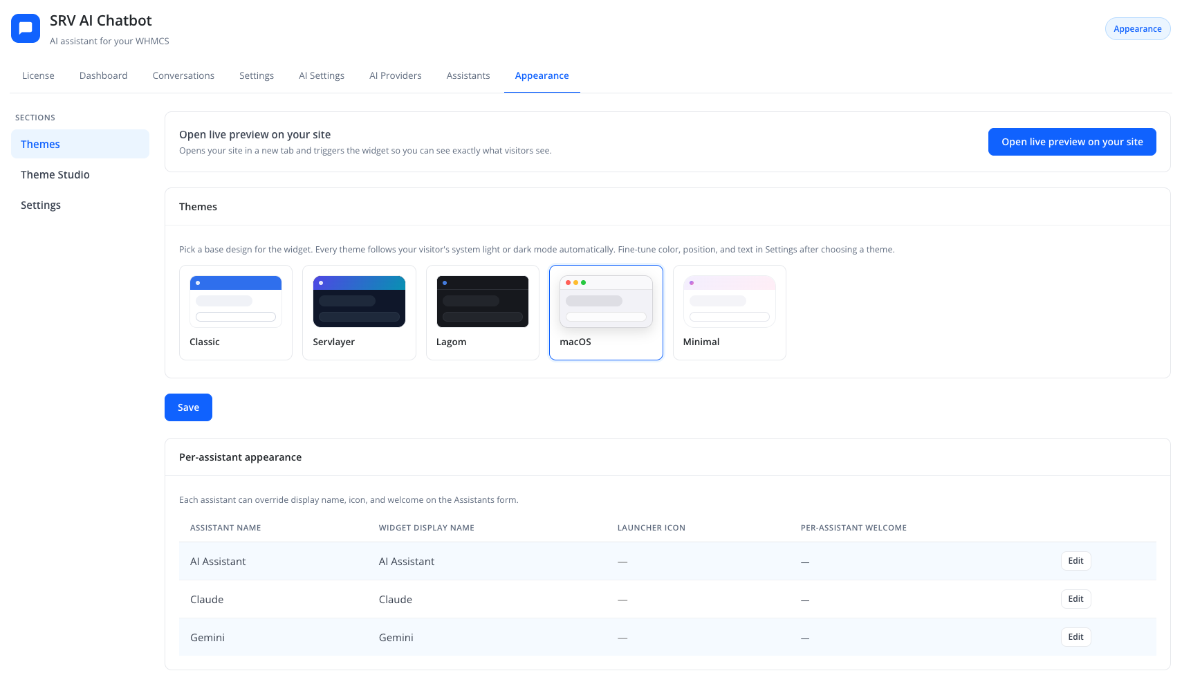
"Pick a base design for the widget. Every theme follows your visitor's light or dark mode automatically (including Lagom’s site dark-mode toggle). For a fully custom design, use Theme Studio after choosing a base."
The Themes section shows a grid of cards, each with a live-style mini preview and a name. Click a card to select that theme, then click Save.
| Theme | Look |
|---|---|
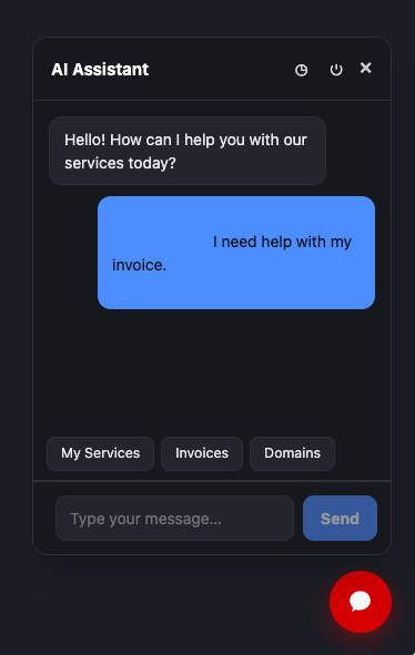
| Classic | The original design — solid primary-color header and launcher, white panel. Default for existing installs. |
| Servlayer | Brand theme: light slate panel in day mode; deep navy with indigo→teal gradients, stacked-layer shadow, and a pulsing launcher glow in dark mode. |
| Lagom | Clean and professional, matching this module's admin panel: blue accent, thin gray hairlines, 10px-radius cards. |
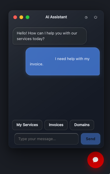
| macOS | Authentic macOS window chrome: traffic lights, centered title bar, Liquid Glass vibrancy, spring open animation. |
| Minimal | Gradient-ring launcher, soft gradient header, flat panel with pill-shaped input and send button. |
Example client-area results:
| Theme | Light | Dark |
|---|---|---|
| Classic | 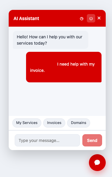 |
 |
| macOS | 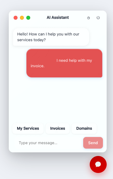 |
 |
| Minimal | 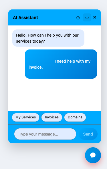 |
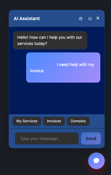 |
Tip
A base theme sets the overall chrome. For brand colors, dual light/dark palettes, shadow, gradients, or Liquid Glass tuning, create a custom theme in Theme Studio and activate it.
Note
Themes work with both the client-area widget and External Embed sites. An active Theme Studio custom theme applies on both paths. RTL (Arabic) layout is supported by every theme.
Theme Studio1.2.0
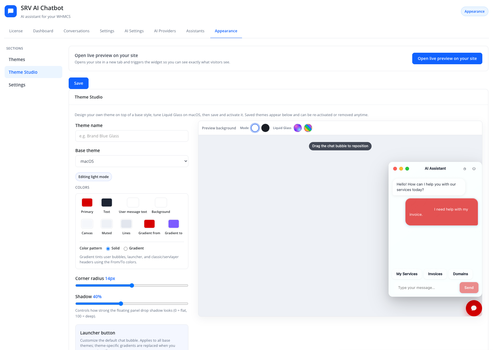
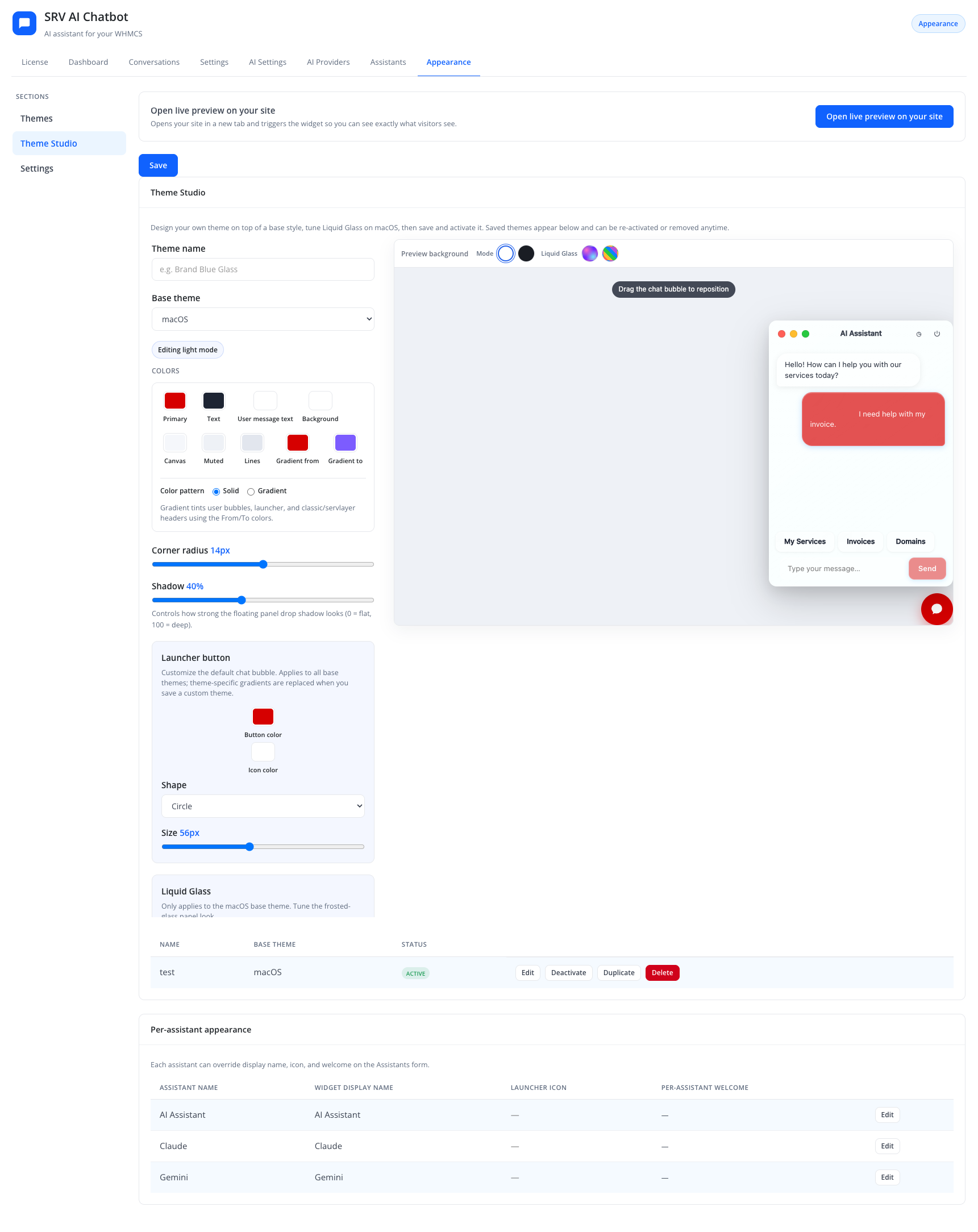
Theme Studio lets you build, save, activate, duplicate, and delete custom themes on top of a base theme. Edits update the live iframe preview immediately. Switch the preview toolbar between light and dark editing modes so each palette is stored separately.
| Control | Purpose |
|---|---|
| Theme name | Label shown in the saved-themes list |
| Base theme | Starting chrome (classic / servlayer / lagom / macos / minimal) |
| Color palette | Primary, text, user-message text, background, canvas, muted, lines — for the mode being edited (light or dark) |
| Color pattern | Solid or gradient (gradient start/end colors) for user bubbles, launcher, and matching headers |
| Corner radius | 0–28 px |
| Shadow strength | 0–100% panel depth |
| Launcher | Shape (circle / rounded / pill / square) and size |
| Liquid Glass (macOS base only) | Tint, opacity, blur, saturation, border glow — separate values for light and dark |
| Preview background | Light / dark / gradient / busy patterns behind the preview (editor-only; not saved in the theme) |
Saved custom themes appear in a list with Activate, Edit, Duplicate, and Delete. Activating a custom theme sets widget_custom_theme_id and overrides the base theme tokens on the live site until you deactivate it.
Tip
Use Open live preview on your site after activating a custom theme to confirm Liquid Glass and dual-palette behavior on your real Lagom (or other) template.
Settings
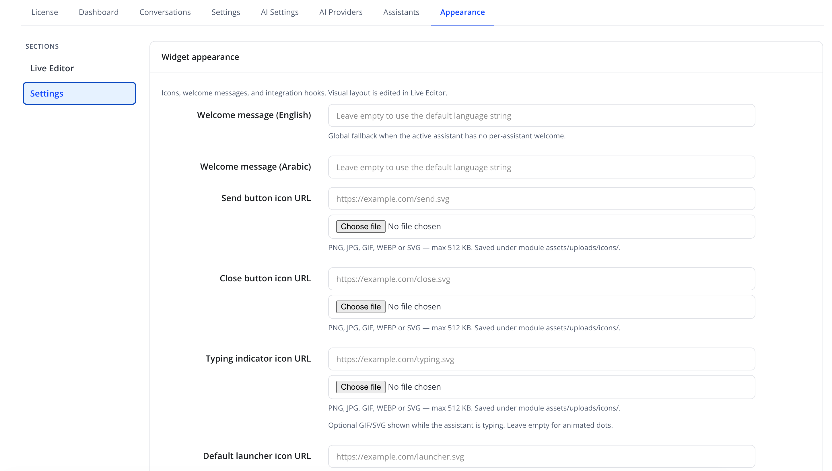
Layout, welcome text, icons, Custom CSS, and integration hooks live here.
| Friendly name | Type | Default |
|---|---|---|
| Position | select — e.g. "Bottom right" | Bottom right |
| Primary color | color picker | — |
| Panel max scale (%) | number (100–150) | 120 |
| Horizontal offset (px) | number | 22 |
| Vertical offset (px) | number | 22 |
| Window title (English / Arabic) | text | empty |
| Input placeholder (English / Arabic) | text | empty |
| Welcome message (English / Arabic) | text | empty |
Custom CSS (scoped under #srv-aichatbot) |
textarea | empty |
| Send / Close / Typing / Launcher icon URL | text + file upload | empty |
| Custom launcher CSS selector | text, e.g. #srvlivehelpdesk |
empty |
| URL hash auto-open | text | #srv-aichat |
Icon uploads accept PNG, JPG, GIF, or WEBP only (max 512 KB). SVG is not allowed (upload or URL) for XSS safety. Typing indicator may still use an animated GIF; leave empty for the default dots.
Tip
Custom CSS is sanitized before save and output: dangerous constructs are stripped and remaining rules are scoped under #srv-aichatbot. Prefer Theme Studio for colors and chrome; use Custom CSS only for small extra tweaks.
Custom launcher CSS selector
If your site already has a "Live Help" or "Chat with us" button, set this to that button's CSS selector so clicking it opens the SRV AI Chatbot widget instead of adding a second floating launcher.
URL hash auto-open
With the default #srv-aichat, visiting a link ending in that hash automatically opens the widget — useful for "Chat with us" links in emails or other pages.
Per-assistant appearance
A read-only note repeats: "Each assistant can override display name, icon, and welcome on the Assistants form." See Adding an Assistant.
Action
Click Save on Themes or Settings to apply those forms. Theme Studio save/activate/duplicate/delete uses its own actions on the Studio pane.
Troubleshooting
| Problem | Fix |
|---|---|
| Widget overlaps other floating page elements | Adjust Horizontal offset (px) / Vertical offset (px) in Settings |
| Custom theme not visible on the site | Confirm it is Activated in Theme Studio, then hard-refresh the client area |
| Custom CSS has no visible effect | Target classes under #srv-aichatbot; remember the sanitizer strips @import, expressions, and unscoped rules |
| Clicking an existing "Chat" button does nothing | Set Custom launcher CSS selector to that button's selector |
| Dark palette looks wrong on a custom macOS theme | Re-edit the theme in dark preview mode and re-save (older themes may lack dark glass tokens) |